This is the first post in the Arts Analytics series and, to kick things off, I thought I’d start with something straightforward – mobile websites.
I’ll cover things in this series of posts that are less clear cut, but this one really is a no-brainer. More and more people are accessing websites on mobile devices (phones, tablets, iPods, Kindles, etc) to find out information, read content, interact and make purchases. The arts organisations that I’ve seen implement a mobile-friendly website have seen (to varying degrees, but without exception) higher traffic and better conversion rates.
Email marketing is terrifically valuable for many organisations and it’s increasingly common for people to pick up their emails on their phones. If you share links to your website on social media then you should know that a higher-than-average number of people who come to your website via those links will do so using a mobile device. Google have said that if they know someone is searching on a mobile then they will consider whether a website is mobile-friendly before deciding to include it in search results. So there’s an SEO benefit too.
In short, mobile matters.
So how are arts organisations adapting to a mobile world? How many have mobile-friendly websites and how have they approached them?
I took my sample group of 100 arts organisations and visited each of their websites using the Safari browser on an iPhone 5. Here’s what I found…
Findings
19 of the 100 arts organisations in my sample group currently have a mobile-friendly website. Of these:
- 10 have a website with responsive design
- 9 have a dedicated mobile website
Of the organisations that haven’t yet accounted for mobile visitors, it’s good to see that very few of them use technology that rendered their site inaccessible on my phone. None of them are built entirely in Flash, for example. That said, Bournemouth Symphony Orchestra, Royal Liverpool Philharmonic, Aldeburgh Music and New Vic Theatre all have large Flash carousels that appeared as big, blank spaces. That’s not so good.
I should also point out that I didn’t make it past the homepage to investigate functionality. It’s entirely possible that people on mobile phones won’t be able to carry out the same range of interactions that desktop users can. For example, I know that some of the ticket-booking systems on those websites will rely on Flash for select-your-own-seat booking.
One final note for this section – I happen to know that three more organisations in my sample group are due to launch new websites with responsive templates in 2013. Things are picking up.
Here’s a slideshow of the 100 arts organisations’ websites as viewed on a mobile phone.

And here’s a spreadsheet of the organisations in my sample group, showing who’s doing what:

Different approaches to going mobile
There are two main approaches to adopting a mobile-friendly site:
- Separate mobile site. When you browse to a website, it recognises that you’re using a mobile device and automatically redirects you to a website that has been designed to be viewed on a mobile phone. For example, see The Sage Gateshead and Sheffield Theatres.
- Responsive design. The website checks the width of the browser window and reformats the page so that it displays well no matter what the size might be. For example, see Birmingham Rep and Soho Theatre.
There are pros and cons to each approach and 101 articles out there discussing them. Google’s comparison is as good as any for a quick overview. As with many things, it really comes down to the organisation’s requirements and the likely return on investment.
At Made Media, we usually recommend that our arts clients go for responsive design where possible:
- One website instead of two means less admin and duplication of effort for busy clients.
- It’s futureproof (well, as much as possible) as far as devices are concerned.
- We’ve seen very slightly improved conversion rates for transactions on websites with responsive design as compared to separate mobile sites.
What to measure and how
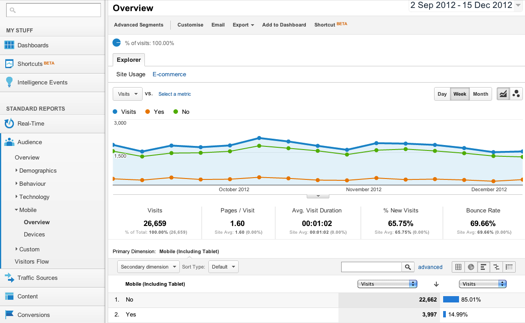
If you want to measure the effect of mobile traffic on your own website and you have Google Analytics set up then it’s pretty straightforward. Just head to the ‘Audience’ and ‘Mobile’ in the left-hand menu and you can find out about the level of mobile traffic your site receives, what devices people tend to use (I’m guessing iPhone and iPad will be way out in front) and what operating system they’re using.
We can do better than that though, especially if you’ve hooked up ecommerce tracking. Want to know what pages on your site mobile visitors look at most, how much mobile visitors spend on average? Then log in to your account and click these links:
In conclusion
- Arts organisations should invest in a mobile website.
- If you take money online (donations, ticket sales, merchandise, etc) then you should invest now. Delay = lost profit.
- Go for a responsive design unless you require some specific mobile functionality or if reworking your existing templates won’t be cost effective right now.
Of course, there’s more you could dig into here. Emma Mottram said she was surprised to see new websites with no mobile version. Unfortunately there’s no quick and easy way to find out how old a website’s design is.
It would be interesting to know how old the websites that I looked at are. I’d be interested to know whether there’s any correlation between organisation’s turnover and whether they have a mobile site too.
A tweet from Matt Hogan pointed out that the five year old Ikon website was launched when mobile was just starting to become a serious consideration. It is noticeable when flipping through those screenshots that some of the non-mobile friendly sites are nonetheless not too bad on the smaller screen.
Arts Analytics is regular a series of blog posts where I compare the websites and general online activity of a group of 100 arts organisations. For more information go to the Arts Analytics page. For round-ups and more, sign up to the email newsletter.