Doing better next time round

Last week I put out a report based on a survey of arts organisations, having asked them what effect changes to Facebook have had on their respective Facebook Pages. You can download it from the One Further website.

I was pretty pleased with how it went. Within a pretty short period of time, I managed to gather some information around an issue and present it to people who will hopefully find it useful. That was the main job I wanted to do. It also gave my new company a small profile boost and helped earn me some new names for my mailing list.

To that extent, I’d consider it a success. However, I’m very aware of room for improvement. If I’m planning to do more quick surveys along the same lines (and I am) then they should build on this one. Stopping to consider lessons learned is a good thing to do whether things went well or not and feedback from others can help immeasurably.

Thing is, people tend to be far too polite about these things when some candid (shout out to Creativity, Inc) feedback would actually be very welcome. For that reason, I’m going to kick things off.

If you read the report or contributed to the survey then please let me know what could be improved via the comments. I’d be very grateful.

Here’s how I think things could be improved.

The survey

It could’ve done with more contributors. 48 wasn’t bad and, considering the lack of time and budget behind it, I think I did well to push it out to as many people as I did. Still, the next one should have more contributors.

The survey’s format was fine but could have been better. Google Forms aren’t bad as far as they go but next time I’ll probably try something a little more swish.

I tried to keep the survey short so as not to put people off that means that plenty of good questions went unasked:

  • Those organisations that have seen organic reach increase – are they buying Promoted Posts? There’s a halo effect that could be causing the organic uplift.
  • When people say they’ve seen an increase or decrease, how much are we talking about? It could be whopping or an entirely arbitrary little flicker.
  • What types of content are organisations posting and does that correlate to the popularity of the organisations’ Pages?
  • How much budget are organisations putting behind Promoted Posts?
  • For those that will be using Promoted Posts sparingly, in what circumstances will they be using them. Will they cutting back on any other costs?

It’s a tricky balance to get right and I’m not sure I nailed it this time round.

The report

I was relatively happy with the layout and styling but it was just knocked together in Pages and is really very basic. Maybe there’s something better I could’ve done.

Is a PDF document the best format? I tend to find that those things pile up in random folders on my laptop. Maybe I’ll look at other options for getting the results to people. I’d appreciate thoughts on that one.

I tried to make the format of the report as clear as possible but, as always with these things, if I’d had time I’d have made it shorter. Again, thoughts and suggestions welcome.

Other things

This was a business activity so, as well as creating a good survey and report, a secondary consideration was how I could get a bit of a profile boost for my new business, One Further. I did achieve that to some extent but I think I could’ve done a few things a little better:

  • I didn’t track how much time I spent on it, which seems a bit silly now.
  • I did ok at getting the message out and I’m very grateful for the Guardian piece but I could possibly do better on the distribution side of things.
  • Again, is a downloadable PDF really best? Next time perhaps a presentation on SlideShare embedded on my site would be better. I could maybe give the PDF away for people who give me their email address.
  • Maybe I could present the results in a few different ways. I’m trying not to use the word ‘webinar’ here…

Onward

So there we go. Thanks for bearing with the introspection. Anything more to add? Hit me with it – I can take it.
Contribute to this survey about Facebook for arts and culture marketers

I’m running a survey about how arts and culture organisations are using Facebook.

The main things I want to find out are:

  • whether organisations have noticed any effect from changes Facebook has made
  • what they’re planning to do in the future

The resulting report should make for interesting reading. The survey’s been open all week and as well as quite a divergence in responses, the ‘Any other comments?’ section has resulted in some fascinating observations.

So far there’s been a great response with a good range of museums, orchestras, venues and theatre companies – from the very small to the very large. Most are from the UK but some US and European organisations have responded too. To pick a few names at random – National Theatre of Scotland, London Symphony Orchestra, Faber & Faber, Britten Sinfonia and The Other Way Works.

If you complete the survey then I’ll send you a copy of the report once I’ve pulled together the findings. I’m likely to blog about it here but, to guarantee a copy, sign up to the One Further mailing list.

Please fill out the survey and, just as importantly, pass it on. The more organisations respond, the better the findings.

Click here to share the survey on Twitter.

If you’re reading this in an RSS reader or in your email (maybe also on a mobile) then it’s possible it might not show up right. You can access the survey directly here: http://bit.ly/FBartsculture.

Share this survey on Twitter by clicking here -> Is Facebook still useful for arts and culture organisations? Complete this survey to get a free report: http://bit.ly/FBartsculture

Arts Analytics: Accessibility

On 15 May 2014 it was Global Accessibility Awareness Day:

The purpose of the day is to get people talking, thinking and learning about digital (web, software, mobile, etc.) accessibility and users with different disabilities.

I’ve only just become aware of this (better late than never) so thought it appropriate to cover website accessibility in this Arts Analytics post, looking at how the websites of the arts organisations in my sample group perform.

Accessibility is an important aspect of a website’s design and development. It’s not just a case of doing the right thing (morally and legally) – there’s a good business case to be made too. The more people that can use your site, the more people can buy your goods and avail themselves of your services. There’s also a strong overlap between accessibility and SEO, increasing visibility of your site more generally.

But it’s also about doing the right thing.

Method

I ran the 100 websites in my sample group through the free scanner at wave.webaim.org and captured the results. Specifically:

  • Number of errors – these are almost certainly causing accessibility issues on the site.
  • Number of alerts – these need to be reviewed by a human who can take a view on whether they’re causing problems or not.

A word of caution – this tool doesn’t claim to have all the answers and the makers stress that it is most effective when used by someone knowledgeable about web accessibility.

For instance, WAVE might happily report no errors, whereas a human might see that the alt text (although present) is insufficient and creates an accessibility problem.

Still, it’s a decent starting point and works well enough for our purposes.

The results

Overall, I thought the results were pretty good. A few concerns in some places, but generally things aren’t too bad.

This wasn’t really much of a surprise. In my experience, arts organisations tend to take accessibility pretty seriously. I’ve worked with some that make a point about going above and beyond with this stuff as part of a wider aim to set the standard in terms of inclusivity.

A couple of headlines:

  • The average website has 9 errors and 32 alerts.
  • The following scored 0 errors: Palace Theatre Watford, Firstsite, The Photographers’ Gallery, South London Gallery and Royal Court Theatre.

Here’s the data sorted by the number of errors found. Data was collected on 20 May 2014.

Incidentally, something about the website for Theatre By The Lake means that WAVE doesn’t work with it. I’ve no idea what that’s about.

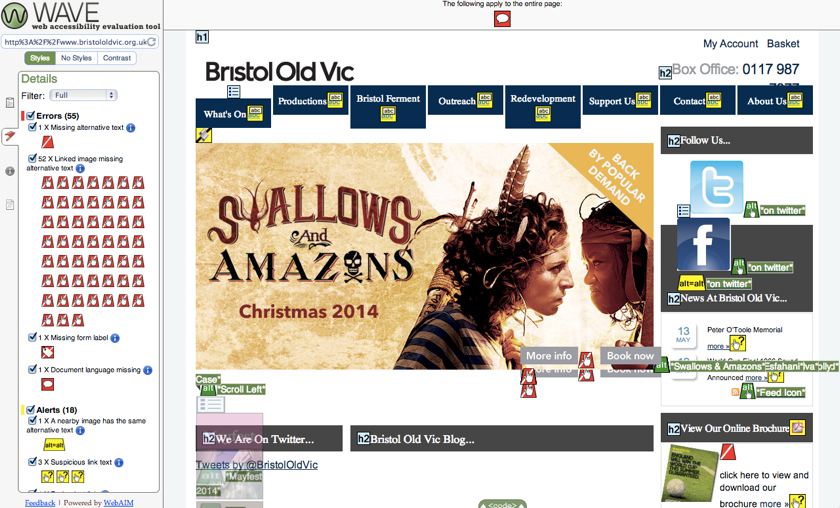
Another observation – you’ll see that Bristol Old Vic scored pretty badly with 55 errors. On closer inspection, 52 of those errors relate to the same thing – linked images missing alt text – repeated over and over. In which case there’s no need to panic – a relatively minor fix should clear things up. See what I mean by getting a real life human to interpret particular results?

WAVE Report of Bristol Old Vic | home

In case you’re wondering why the site looks mangled, it’s because WAVE inserts icons to show errors, alerts and other noteworthy features.

Recommendations

Ensure that accessibility is considered as part of the development of websites, apps and other digital projects.

If WAVE flags up a lot of errors or alerts on your site then it’d be worth getting someone to look into the true extent of any accessibility issues. That person can then make some recommendations for improvements.

Also bear in mind that even if your site scores well with WAVE, that’s not to say your site is necessarily accessible. If you want to get your site checked out properly then get a knowledgeable human to do it – the robots haven’t taken over yet.