Tate recently launched the beta version of their new website. I’ve not dug into it very much but, at first glance, it looks very nice.
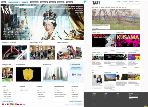
Someone on Twitter (apologies, I forget who it was and can’t find the tweet now) mentioned that it looked very similar to the V&A‘s website, which it kinda does – here’s a side-by-side for you:
They are similar – navigation along the top, a big hero image, a grid of smaller images to signpost people to other areas of the site and then a catch-all footer, with plenty of white space to let the images shine. The lack of social media-related features on either is an interesting sidenote but that’s off-topic for this post.
If you think about it, though, it makes a lot of sense for them to look similar and it has nothing to do with one ripping off the other. More likely, it’ll be down to feedback from rounds of user testing and maybe also the requirements of implementing mobile-friendly responsiveness.
The thing is, people might balk at the idea of a samey-looking web, but a recognisable structure means that people can spend more time doing whatever it is they visited the site for. Put me on a WordPress blog, a Facebook Page, a Tumblr or similar and chances are I’ll find my way around the all-important content without wasting time thinking about how to do it.
Call me utilitarian, but if I want info about what’s on or directions to a venue then I’m unlikely to want the website to ‘surprise and delight’ me with an innovative navigation tool (*cough*spiritnottingham*cough*). I just want the info and/or the directions, dammit. I’m not saying there’s no place for being clever/different/experimental, just make sure it doesn’t get in my way.
