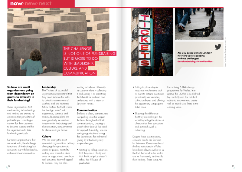
I was flicking through a copy of Now, New and Next, which is a magazine from the Arts Fundraising and Philanthropy programme.
There’s a good article about how smaller organisations are diversifying their fundraising efforts and it calls out a few small changes that are making a difference…
Putting in place simple response mechanisms such as donation buttons positioned prominently on websites, collection boxes, and offering the opportunity to top-up the ticket price.
I want to pick up on the ‘donation buttons positioned prominently on websites‘ bit and add something so that people don’t get the wrong idea.
It’s this. I’ve seen websites with donation buttons sprinkled all over the place, I’ve fielded requests to add them (back in my web design agency days), and I’ve seen the stats showing hundreds of thousands of people across multiple websites all ignoring them.
You know that awkward thing where someone goes in for a kiss and the other person dodges?
That’s what it’s like seeing those buttons littered around the place.
That’s not to say you can’t ask for a donation online. Of course you can. But context is key.
A donation button should be there, ready and waiting, when:
- You’ve provided some sort of value to someone. For instance, if someone has been allowed to download all your podcasts or learning resources then absolutely ask for a donation towards the cost of producing and maintaining those things.
- The person already has their credit card out. A simple message at the point of making a transaction can work very well.
- On a landing page for an email/social campaign. You’ve warmed the recipient up to the idea of a fundraising campaign in their inbox or news feed, they’ve clicked through and the call to action on your landing page is there to seal the deal.
You may have your own things to add to that list, and I bet the context is stronger than ‘the person just happens to be on the website’.
It’s why these days the smarter sites are falling over themselves to offer you an ebook, a chance to win stuff, access to a back catalogue… something in order to pull you in. That offer is their most prominent call to action. The idea is that once the person is (contentedly) hooked they can then start building a (more lucrative/engaged) relationship with them. There are even whole products built around this premise.
So to sum up, from what I’ve seen, ‘donate’ buttons on every page on your website are likely to be ignored. If that’s the best you can do for now (and the article was aimed at smaller orgs) then fine, I get it. But I’d highly recommend doing something that brings the person into a context where they’re more likely to want to donate to you. Then you should make the ask.
