Of all the Twitter visualisations I think this is my favourite so far.
It’s a Yahoo! Pipes/Google Charts mashup made by Xefer which plots the frequency of tweets and replies by day and hour. More importantly it looks kinda cool.
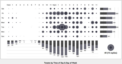
You can see my original and/or make your own here.
(via Mediaczar)
Comments are closed.