I was staring at posters on the Tube earlier today and a couple of them made me think. I didn’t take pics but you’ll get the gist from these screenshots.
Here’s the first one.
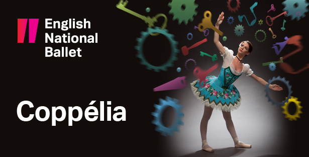
I was idly wondering whether that accent in ‘Coppélia’ has any affect on ticket sales.
Could it maybe give people the idea that the production will be hard to understand, more ‘foreign’ and less accessible to an English audience? Might it make people think that they’re less likely to ‘get it’?
If so, is it still worth it from an artistic (or even educational) standpoint to spell the name correctly? It is the character’s name, after all. I’m also all for assuming that people have a modicum of intelligence.
Maybe (probably?) the accent doesn’t make the slightest difference. Still, it’s something that would be interesting* to A/B test if the circumstances ever arose. You could maybe do it via PPC ads, with the title being the only change to the copy across ad units.
What prompted this wondering was a conversion with someone about the way that ballet and opera companies (and it’s mostly ballet and opera companies that do this) sometimes talk about wanting to get more people in to see their productions, but then insist on putting titles in a foreign language. This is a very benign example of a foreign language title, but still.
Here’s the second one, and this is more about getting something off my chest.
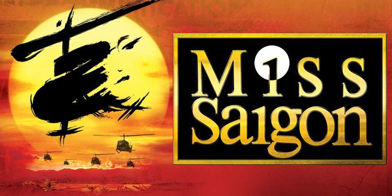
The spacing of the word ‘Miss’ just really annoys me, specifically the gap before the final ‘s’. I know the letters are spaced evenly, but the circle behind the ‘i’ obscures that and throws it all out.
This XKCD comic is relevant to this.
* ok, interesting to me.