In a recent Cultural Digital email I said that a newly-launched website for a visual arts venue (I’m not naming them here) fell short in terms of “accessibility, performance, search engine optimisation, and other modern website standards/basic common sense”.
I wanted to write something a bit more constructive about the kinds of mistakes and omissions I spotted, so here goes.
Taking the four areas I mentioned in order…
1. Accessibility
You shouldn’t need perfect use of your body and senses to use a website. Just like you shouldn’t in order to enter the venue itself. As well as the obvious ethical reasons for making your website accessible, there are commercial and, possibly, legal ones too.
There are some standards for this. W3C’s Web Content Accessibility Guidelines are widely used. Let’s run the website in question past their most basic accessibility issues and see how it does:
- Page title: This should be an easy one. Each page should have a distinct title to tell people what page they’re on. However, on this site they’ve just got the website’s domain name as the title for every page.
- Image text alternatives (“alt text”): There’s no alt text for any of the images that I looked at.
- Text:
- Headings: There are no H1, H2, etc tags to give structure to the page and help people (or screen readers, or search engines) understand the structure of the page.
- Contrast ratio: In several places there’s not enough colour contrast between the text and the background. The WebAIM colour contrast checker can help with this.
- Resize Text: Finally, something that’s ok! You can resize the text in your browser and it doesn’t cause terrible layout issues.
- Interaction:
- Keyboard access and visual focus: Some of the most important elements aren’t accessible via keyboard shortcuts – specifically the menu and any of the buttons to buy tickets or memberships.
- Forms, labels, and errors (including Search fields): This is fine.
- General:
- Moving, Flashing, or Blinking Content: This is generally fine, although there is some overlapping text in some places.
- Multimedia (video, audio) alternatives: I didn’t spend much time looking for multimedia content. I did find a YouTube trailer and it was possible to select and control that via keyboard shortcuts, at least. There was no transcript though.
- Basic Structure Check: Everything’s laid out in the right order, but it’s as if structural, semantic HTML doesn’t exist – it’s just div after div. Designing With Web Standards came out fifteen years ago but the lessons still apply.
All in all, that makes for gruesome reading, and I’ve only just scraped the surface.
A proper accessibility audit needs to be done manually but, if you’re interested in getting a headstart, you can get some of the way there with a few tools. Google’s Lighthouse is one.
Lighthouse scored the site 10 out of 100 for accessibility.
2. Performance
This is all about how quickly the site loads for the user. Site speed is important for all sorts of things, not least a decent user experience.
Site speed tests don’t tend to tell you how fast the site loads as such, because that depends on a person’s internet connection. Instead, they look at the size of the website you’re serving up, and then look to see how many techniques you’ve used to deliver the website as quickly as possible.
This site is pretty simple, but still manages to be a lot slower than it should be. The main problems are:
- The images. The sites asks you to download much larger ones than it needs, shrinking them down in your browser. They’re also not optimised.
- The site could also make use of caching.
- It could also handle the 12(!) CSS scripts better.
Of the tools for grading website performance:
- Lighthouse scores the site 8 out of 100.
- Google PageSpeed gives it an F.
- YSlow gives it a C.
3. Search engine optimisation
If you want to show up in search engines for relevant keywords then you need a website that features relevant content, that’s easily understandable by search engines, and that’s linked to by other relevant and reputable websites.
With cultural organisations there’s often minimal competition for the most relevant keywords and their sites usually attract good quality links without much effort. If you just care about being found by people who already know you exist, then that’ll usually be enough. You can even get by with a poorly optimised website.
That said, there are still plenty of reasons to get the basics right.
Many of the accessibility and performance issues above are also basic aspects of search engine optimisation. A quick glance shows that the site is also lacking:
- The name of the organisation on the homepage.
- A robots.txt file.
- Schema markup.
- Meta descriptions for each page.
On that last one, Google displays the meta description on the search results page when your website shows up.
If you don’t set a meta description for each of your pages then you’re at the mercy of whatever Google happens to pull out. Here’s a random example of what can happen…
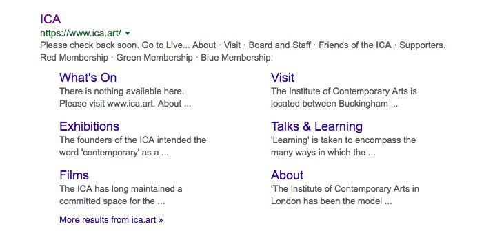
You don’t really want phrases like ‘Please check back soon’ and ‘There is nothing available here’ showing up.
4. Other modern website standards/basic common sense
There are some other technical issues, and some others that I’d flag as potential usability banana skins. For instance…
- I’m willing to bet that a quick test (on something like UsabilityHub) would show that nobody can guess where the menu is.
- The homepage defaults to showing what’s on, but shows today’s date at the top. That confused me, because I was looking on a Monday and they’re closed that day.
- The date picker feature is just a pain all round.
- Can you guess the difference between Red Membership, Green Membership, or Blue Membership? Those are the titles shown in the menu.
- There’s no Open Graph markup.
I bet there’s more. I’ve only looked at a few pages.
UPDATE: I ran a very quick test and yeah, 84% of people failed to guess where the menu was. That’s crazy. They also took on average of 30 seconds to complete the test – that’s a lot of time to do such a simple task.
It’s common enough to use a logo as a link to the homepage (and from the user testing I’ve done before, even that’s not universally understood), but I’ve never come across it being used to open the menu before. Apparently I’m not alone.
To sum up
There’s nothing here that can’t be fixed, and presumably the website is a work in progress. But…
It’s not as if the things I’ve pointed out here are fancy ‘nice to haves’. They’re the basic building blocks of a competently built website. This stuff isn’t hard, and I really can’t see why a progressive, forward-looking organisation can’t reach that minimum level.
Finally, I just want to make clear that I’m not talking about the general look and feel of the site here. That’s much more of a subjective thing. It’s not my cup of tea, but then I don’t think I’m their target audience.
Great critique, Chris – thank you for the post. It makes for a very interesting design discussion. Besides your very objective observations – what I *really* don’t get is the reason for the RGB model animation on the bottom left. Why? There is zero reason/ need for it. I first looked at the site on mobile, where said animation is really prominent. There is no way to turn it off and ultimately I had to stop looking at the website because it made me motion-sick. It has no function, so I would definitely suggest taking it down. I don’t like dissing websites too much – we know only too well what clients can be like, especially cultural institutions, so we have no idea what kinds of pressures/ requests the design studio might have been under. However, complying with basic accessibility rules / DDA legislation is something that *must* be pushed onto whatever board or committee.