Arts Organisations on Facebook: who’s doing best?

In this post I wanted to take a look at which of the organisations in my sample group seem to be getting some traction on Facebook.

I wanted to see who’s attracted the most attention, who’s making the biggest noise at the moment and (especially) who’s managing to punch above their weight.

Findings

Here’s what I found:

  • All 100 organisations have a Facebook page
  • 91 of them are using a vanity URL
  • Average likes: 18,488
  • Average number of people ‘talking about’ an organisation’s page: 794
  • Average ratio of likes to ‘talking about’: 0.04

The organisations with the most likes

This is the total number of people who have ever clicked Like on the page (not just an update on the page):

  1. London Symphony Orchestra
  2. London Philharmonic Orchestra
  3. Royal Opera House
  4. Royal Philharmonic Orchestra
  5. Philharmonia Orchestra

The most ‘talked about’ organisations

This is the number of unique users who, in the past month, have engaged with the page in some way – this happens when someone likes a page, posts on the wall, likes or comments on or shares a post, answers a question, RSVPs to a page’s event, mentions the page in a post or take various other actions. You get the idea.

  1. London Philharmonic Orchestra
  2. Philharmonia Orchestra
  3. Royal Philharmonic Orchestra
  4. London Symphony Orchestra
  5. Royal Opera House

It’s the same organisations in both lists, just in a slightly different order. That’ll partly be because (as you’ll see in the table below) the numbers for those five seem to be in a different league to everyone else’s. Beyond that though, some sort of correlation should probably be expected. Let’s have a look at a graph to check (I’ve actually removed the top five to make it easier to decipher at the lower end).

Facebook - Likes v Talking about

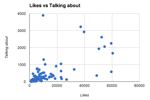
Yep, that’s about what I’d expected. How about those outliers though? Those are organisations that are being talked about more or less than you’d expect, going by the number of likes they’ve gathered. For instance, that dot in the top-left corner is someone being very popular.

Here’s the data, collected on 28 February 2014 and sorted by the ‘Talking/Liked ratio’ column.

The organisations punching above their weight

Divide an organisation’s ‘talking about’ figure by their number of likes and you get a ratio you can use for comparison. By this method, these are the organisations that are currently doing best on Facebook:

  1. Northern Ballet Theatre
  2. Aldeburgh Music
  3. Brighton Dome
  4. Opera North
  5. Theatre Royal Plymouth

These are the outliers from that graph. The positive ones, at least (scroll to the bottom of the spreadsheet if you want to see the others). Our ‘big 5’ from earlier on don’t look quite so hot by this measure.

I’ll let you click around and see what’s what.

What does this all mean?

Something to point out straight up – this is all very variable. That ‘talking about’ number could be affected by all sorts of things. For instance, a big announcement, a season onsale, a major event, a Facebook ad campaign… the list goes on. So really my table shows a snaphot of how things were at a single certain point in time. We’d need to check the standings over a longer period to be able to say that (for instance) Northern Ballet are absolutely the best at Facebook.

Beyond that, as always, this information can only tell us so much.

The number of likes a page has attracted is pretty much meaningless. In fact, here’s me when someone tells me about how many likes a Facebook page has:

Sorry if you’re reporting that number to anyone. All it can really tell you is how many people once heard of an organisation and expressed some sort of affinity for it. That’s about it. Ok, maybe it indicates how many people might show some propensity for engaging with your updates in some way. But that’s it.

The number of people talking about a page is a much more interesting figure. Those are people who do give a bother about you and have done recently. That’s the one that I’d be most interested in if I was running a Facebook page.

But even then, having lots of people talking about you on Facebook might just mean that you’re good at Facebook. If the point of your organisation is to make people click things on Facebook then you’re winning. If not, then you need to make sure it’s all being done to benefit your organisation in some way. Put more bluntly, what’s better?:

  • A picture of a puppy with a ballet shoe in its mouth that gets 3,000 likes and 50 shares; or
  • A link to a ballet performance show that gets no likes but sells 10 tickets?

Come to think of it, your answer to that would could be very telling in all sorts of ways.

Recommendations

I’m not about to turn this into a ‘how to succeed on Facebook’ post. There are plenty of those out there. All I’d say is:

  • Take a look at the organisations that seem to be doing well and take inspiration from them.
  • Look for organisations that you think are ‘doing Facebook well’ in a way that hits a sweet spot between pleasing users and furthering the goals of the organisation.
  • If anyone says ‘this organisation is doing well on social media because they have [n] likes’ you have my permission to roll your eyes at them and sigh theatrically.

This post is part of an ongoing series where I’m using digital metrics to see what a group of arts organisations are doing online. See other posts in the Arts Analytics series and sign up to the free email newsletter.

Arts Analytics: Title, Description and Keywords

It’s the first Arts Analytics post in a little while so I thought I’d go with something simple. I wanted to look at how many of the arts organisations in my sample group have been diligent in making sure their homepages have:

  • Title tags
  • Meta description
  • Meta keywords

I was also interested in seeing how they were using those things.

Finding this information is easy, if you want to do it yourself. Right-click anywhere on a web page and (in Chrome – other browsers may vary) click ‘View Page Source’. Then search for title, description and keywords to see what’s been added.

Here’s what I found, with organisations sorted alphabetically.

To explain the colour coding, I’ve gone with a traffic light scheme – green is good (only added here for descriptions of a good length), yellow means there’s room for improvement and red is bad (although you can ignore that as far as keywords are concerned for the reasons below).

Findings

  • 100% have a title
  • 9% of those titles are too long
  • 88% have a meta description on their homepage
  • 31 of those 88 meta descriptions are too long
  • 56% have keywords
  • If an organisation’s homepage has no meta description, it won’t have keywords either.

What it all means

Google announced all the way back in 2009 that keywords and descriptions have no bearing on search engine results. So what’s the point in looking at these three things?

Title

This one’s very important. Definitely make sure this says the right thing. It’s one of the most important signals that search engines look at when working out what a page is about. It’s also the thing that shows up at the top of an entry in search engines. For instance, in the example below it’s the bit that says ‘Institute of Contemporary Arts’.

institute of contemporary arts - Google Search

Description

Not important in terms of getting your website up the search results, but more relevant to persuade people to click on it when they see it. In the example above, the meta description is the bit of copy under the URL. If someone shares a page on Facebook there’s also a good chance this is the copy that’ll be used (if nothing else is specified).

Keywords

This one’s really not important from an SEO perspective. In fact I only included in because I was interested to see what people are doing. The only thing I could think of is if your site was reported for dodgy SEO practices – having a surfeit of spammy keywords might not endear you to a human reviewer. Walsall Art Gallery go a bit overboard with theirs, but at least they’re mostly relevant.

Recommendations

Here’s what I’d do:

  • Make sure you’ve got a title tag. It should be less than 70 characters long and should describe the main thing about that page. In the present case I’d just go with the name of your organisation.
  • Add a meta description. Don’t go over 155 characters and bear in mind that it’ll be seen by people searching on Google or flicking through Facebook. Entice them to click your link!
  • Seriously, don’t bother with keywords unless you’ve got too much time on your hands.

I’ve only talked about homepages here. The only thing to add about applying this to other pages on your site is to ensure that titles and descriptions are unique for each page.

If you want to get into this in more depth (and there are all sorts of ways to complicate this) then there are plenty of guides out there. This guide from Moz is as good as any.

Backwards and forwards

I’ve been looking back at the past year of posts on this site to see what I want to carry on and what I want to rethink.

It’s pretty easy to bundle 2013’s posts into a few themes – arts analytics, big data, monthly links, thoughts on research and notes from talks/events. A loose kind of structure has worked pretty well for me, letting me settle into subjects more than I might if I was being a bit more scattershot.

The mailing list was a good addition too. I’ve not sent out as many emails as I should have, but sign-ups have far surpassed what I expected (in terms of quality and quantity).

Overall, I wrote fewer posts in 2013 but got roughly the same amount of traffic as in previous years. That suggests I’m either writing about more interesting stuff or I’m promoting it better. I’m reluctant to believe it’s the latter (I don’t think I go particularly overboard touting these posts around) and the former, if it’s anywhere near the truth, is a happy accident.

The outline plan for 2014

Firstly, I’m going to stick to broadly the same themes. In the immediate future I’m going to:

  • Publish a post explaining the Mitos21 talk I gave back in November. That’ll come out in four parts over Jan. There’s quite a bit to write and that’ll save me having to wait until it’s 100% done before releasing it into the wild.
  • Revisit and finish off the Big Data posts. Life got a little hectic around the time I was thinking about that stuff, but I’ve got a couple more things to say before I’m happy to put that to bed.
  • Pick up the Arts Analytics series again. Those posts tailed off in the latter half of 2013 but they were quite fun to do and I’ve got a stack of topics to work through.

An email to the mailing list will go out every couple of months. It’ll feature highlights from the blog plus some extra goodies. Sign up for that here.

I’m going to stop the monthly link round-ups. If you want to see the interesting stuff I come across then you’re welcome to take a look at my Pinboard account. Check in on CulturalDigital – I’ll be posting links to things on there and hopefully others will too.

Oh, and I’m just in the middle of sorting out a new theme for this blog. Apologies for any inconvenience this may cause to your journey.

Finally, if there’s anything you’d like to see more do more (or less) of then let me know – I’m listening…