NB: right now this post is a bunch of hastily thrown together notes. I’ll come back and add, edit, rearrange, and rephrase things later.
What’s On listings tends to live in four places:
- Dedicated What’s On / listings pages
- Specific groupings (often season or series)
- Homepage
- Relevant other pages – production pages, blog posts, about pages – where productions / what’s on listings are presented contextually.
These might fit on a spectrum depending on the range you show to the user at any point…
- You pick (eg. what’s on listings page)
- Pick from a limited range (eg. season grouping or ‘you may also be interested in’-type recommendations)
- Our selection (eg. homepage)
These notes are focused on the dedicated What’s On listings that are common to most cultural organisations.
User behaviour on What’s On listings can be lumped into two types:
- Browsing (the person may not be sure what they’re looking for, but is likely to have some criteria in mind)
- Searching (the person knows exactly what they want and everything else is a distraction)
Users with different aims are going to have different requirements. They’ll want to find their way through event listings in different ways and their mode of behaviour might change from one to another at various points.
There are various tools that can be used on a What’s On listing page to help a user find what they want:
- A list of every production/event
- Filters (including faceted search)
- Date picker
- Highlight block (to bring up the big show that might otherwise be lost in the jumble of other events)
- Search bar
- Personalised results (based on preferences, browsing history, etc)
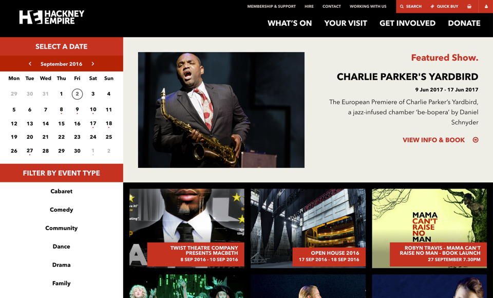
For example, Hackney Empire’s what’s on listings contains a list, calendar, filters, and a highlight block.
A person searching for a specific event may well just use the search bar, or pick something in the highlights block. Someone who’s just browsing may want the full list, or a broad filter.
Once they’ve narrowed a selection down to a list, how do they parse that? That’ll depend on how big the list is and what their next criteria is. This can be hard to judge but there are well-known trends. For instance, for classical music, repertoire is key.
Following from this, there’s an argument for adding ‘comparing’ as a third mode of behaviour. This often comes into play slightly later in the process, when a user has chosen a production / event and is looking for a particular performance. Have you ever clicked through multiple dates of a show looking for seats in the right area, or for the right price? That’s the sort of thing I mean.
Filters
Filters tend to relate to production-specific metadata:
- Artform / genre / category
- Theme / season / series
- Presenting company or cast/creative
- Repertoire
- Event type (family, relaxed, etc)
Or more practical logistics:
- Location (country, city, venue)
- Date (via a date-picker or calendar) and/or time (e.g. matinee or evening)
- Price
- Availability of tickets
Different organisations will need to handle these in different ways depending on the type of programme they offer, how sets of events might be bundled together (eg season subscriptions), the ticketing system/CMS they have in place, and various other considerations (price and availability can often be tricky to handle for nobody’s particular fault).
Back-end
The back-end storing of events is in a pretty good place these days. There are good systems that can handle this. Where those back-end systems can fall down is in:
- Not having custom fields that allow you to tweak the last 10% to get a setup that totally matches your needs
- Integrating with a CMS or other parts of the digital marketing stack
- Providing some types of data (I’m looking at you, availability) via an API
These problems tend to be worst for organisations that are using older websites or ticketing systems.
Front-end
Questions to ask:
- How much information about a production should be put on the What’s On page? You want to avoid people having to click into every production to get the info they need.
- Should individual dates for a performance be listed separately?
- How should productions be ordered?
- What’s the best way to list everything – grid, list, calendar… other? And if you have multiple options, what should the default be?
- What do you do with really long listings – paginate, infinite scroll, etc
- With filters, what order should they be in and what should be the default state of each. Is faceted search a good way for you to go?
- Whether to put everything together or not (what if a large number of smaller events drown out the main productions?)
- Should every event be treated the same and given the same prominence?
- Should events be differentiated in a listing through, for instance, colour coding or iconography?
The optimal layout for listings might depend on whether the user is in a browsing or searching mode. An image-heavy grid might work for flicking through lots of one-off events; a list might better suit someone who’s picking from a filtered selection.
Testing
When you’re doing user testing of What’s On listings you might consider testing:
- User generally browsing for anything at all that might be of interest
- User looking for a specific show (ideally not something at the top of the listings or in a highlight block)
- User looking for something featuring a specific cast member (where relevant eg ‘the play with Billie Piper in it’)
- User looking for something on a particular date (eg when friends will be visiting)
- User looking for something they can take the grandchildren to see/do
You can also put constraints in the way of people – ie not allowing them to use the search feature.
And don’t forget to test on several types of device. Filters tend to be designed really well on desktop, but less so on mobile because they take up quite a bit of space when open and are ignored when closed (this is a massive generalisation – good examples are out there).
Also, heatmaps are a shortcut to seeing:
- Which filters people tend to click
- How popular your search function is
- Which part of the search listing people click on (non-clickable images are a classic)
- How far down the page people are willing to scroll
A few cases studies
NB: many of these might be outdated now, with the websites having been updated.
Tate puts all events behind filters, which assumes that nobody is going to be interested in everything and that it’d be best to get some of those preferences down early on.
Royal Albert Hall homepage and what’s on are interesting to contrast.
Royal Opera House again, compare homepage and what’s on.
Southbank Centre Lots of events and an example of the ‘tag everything and let people filter it’ approach.
London Symphony Orchestra a different set of considerations for a classical audience.
The V&A. An example of a complicated one, with a mixture of:
- paid and free exhibitions
- permanent displays
- courses
- talks/lectures
- and more…